New Consumer Trends in Food Label Design: Less Text, More Impact
Food packaging is undergoing a shift. Today’s consumers want clear, immediate information—without the clutter. In response, food brands are rethinking label design, favouring clean visuals, intuitive icons, and minimal wording that still delivers essential details.
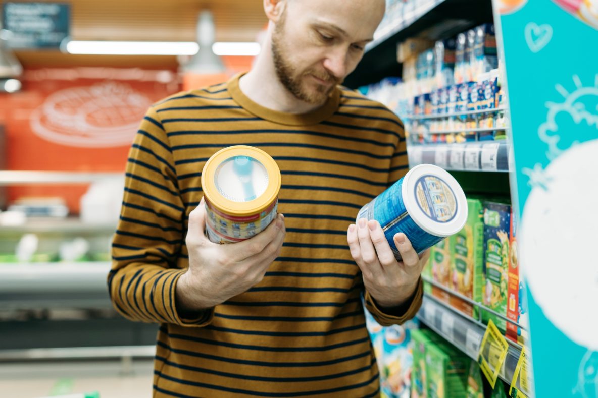
Clarity Over Clutter
In a competitive retail environment, labels need to work fast. Research shows that shoppers often make decisions in under ten seconds. Long ingredient lists or dense product claims are falling out of favour. Instead, brands are opting for:
- Larger fonts for nutritional values
- Simplified allergen callouts (e.g. “Contains: nuts” in bold)
- High-contrast colours for better readability
This less-is-more approach helps build trust, particularly for consumers with dietary restrictions or health concerns. A clearer label also feels more honest, which can positively influence perceptions of the brand overall.
Rise of Iconography
Visual language has become a key part of modern label design. Recognisable icons—such as vegan symbols, recycling marks, or sugar content badges—allow consumers to scan for information quickly. These visuals reduce language barriers and appeal to a growing global audience. They also support better accessibility for those with limited literacy or visual impairments.
Icons also help with shelf impact. A small symbol can communicate more effectively than a long sentence, especially in categories with tight space like snack bars or drink bottles.
Front-of-Pack Focus
More brands are putting critical data on the front of the pack. This includes:
- Traffic light-style nutrition labels
- “High in Protein” or “Low Sugar” stamps
- Quick QR codes linking to detailed product info
This trend is particularly strong in categories like plant-based, gluten-free, and fitness foods, where consumers seek reassurance about what they’re buying. QR codes also allow brands to update product information in real time, without needing to redesign packaging.
Less Legalese, More Transparency
Regulatory requirements still need to be met, but brands are learning to communicate mandatory information without overwhelming the consumer. Some achieve this by moving secondary details to the back or sides, freeing up the front for key claims and branding. Others use digital solutions—such as QR codes—to host full ingredient lists, sustainability credentials, and sourcing details online.
Emotional Design Matters
Beyond the data, food labels are becoming more emotionally engaging. Soft colours, hand-drawn illustrations, and storytelling through visuals help humanise the product. This is especially effective for artisan or local brands seeking to build a connection with conscious buyers.
Design also signals product positioning—minimalist packaging often aligns with premium or health-focused offerings, while bolder graphics can appeal to a younger, trend-driven demographic.
What This Means for Brands
To stay relevant, food producers should consider:
- Streamlining label text for faster reading
- Using trusted, well-designed icons
- Ensuring key information is visible at a glance
- Exploring tech integration for extended content
- Investing in design that reflects brand values and lifestyle fit
Today’s label must do more with less. It must inform, engage, and persuade in the space of a few square centimetres. For brands ready to adapt, smart label design offers a chance to stand out and better connect with modern consumers.